Wednesday, November 28, 2012

#10: Legend of Pop - Peter Max

Peter Max is a longstanding household name in the pop art scene that is akin to Andy Warhol. Since the 1960s, he has been acknowledged and risen to fame for his eclectic and vibrant style and contribution to the history of psychedelic posters during a time of great social movement, protest, and experimentation amongst the youth culture. He is considered to have revolutionized art the same way that the Beatles made such a huge impact on the music industry. Today, at 74-years old, he continues to commission legendary pieces of artwork with such prestigious patrons as the Grammys, Olympics, six presidents, United Nations, and current, popular celebrities such as Taylor Swift and Shaq.

(A younger Max in the past, doing what he loves)

(A more recent photo of Max, featuring his piece on a grand piano for Ringo Star) 


As a child, Max moved around periodically across the world, having lived in China, Tibet, Israel, France, Germany, and America. Having explored and immersed in such a diverse set of cultures and societies, Max was greatly influenced by his various surroundings and quite open-minded and enlightened by the wonders of the infinite beauty that was abundant in each different country. His insight provided a rich background and fuel for his immense artistic creativity. What really ignited his artistic endeavors, however, was his thirst and love for astronomy. He was enthralled by the grandness of outer space and celestial elements, which, combined with his love for art, created his famous, trademark technique known as the "The Cosmic '60s". This style involved a bold, linear type of painting that was art-nouveau inspired, and which utilized Fauvist color choices, and chill, transcendental themes and imagery. This style was revolutionary amongst psychedelic posters and made a dramatic impact on art during the 60s. His expressionistic, sensuous style, lavished with vibrant pigmentation and symbolism has gained him numerous followers throughout the young generations of America.


(above are prime examples of his "Cosmic 60s" style) 

Similar to other psychedelic poster designers of his time, Max did art not for commercial intentions but for establishing strong, influential social viewpoints. An environmentalist and embracer of democracy and justified freedom, Max often included his personal opinions about society in his work. He encouraged environmentalism and a healthier Earth through art. His famous works that depict The Statue of Liberty and great Presidents were dedicated to his passion for justice and a liberated American society. 

(Max's piece done to promote Earth Day)

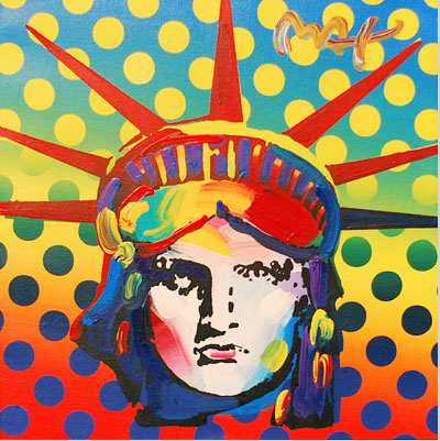
(Max's piece done in 2000 of the Statue of Liberty. Considered to be one of his most monumental masterpieces) 

To this day Max has contributed much famous artwork to America and the world. Although many artists of olden day have disappeared or unable to compete with the more modern generation of artists, Max continues to establish and reinvent himself strongly within the industry. His styles has influenced numerous followers who implement his vibrant and distinct style in their own creations. Max has remained relevant with his work and current exhibitions of famous celebrities, from Taylor Swift and Steven Tyler to Obama! His work and style has evolved from the psychedelic days of the past to a more modern era of pop art. The man remains an influential and extremely innovative legend that continues to awe the current youth generation similarly to how he did the same during the 60s.


<"http://www.naplesnews.com/news/2009/feb/18/peter-maxs-obama-44-visits-naples/">
<"http://gregcookland.com/journal/2010/08/24/peter-max-speaks/">
<"http://www.ctpost.com/music/article/Pop-artist-Peter-Max-returns-to-Geary-Gallery-3828147.php#photo-3375018">
<"http://www.examiner.com/article/renowned-modern-artist-peter-max-gallery-exhibition-and-special-appearance-cherry-creek">
<"http://www.petermax.com/bio.html">
<"http://gregcookland.com/journal/2010/08/24/peter-max-speaks/">

Wednesday, November 21, 2012

Doyle Dane Bernbach Advertising Agency

Doyle Dane Bernbach is acknowledged for revitalizing the advertising field during what was considered to be a lackluster drought of creativity during the 1940s. The industry was strife with "hyperbolic slogans, movie-star testimonials, and exaggerated claims" (Meggs 403). Everything was being thrown and stuffed down the throats of consumers; there was an overwhelming plethora of ads screamed out  exclamation points!!! and ~~~images~~~, but it was all presented sloppily and there was too much of it! It sort of reminds me of the current advertisements that surround us, such as billboards on every highway or advertisements on every multimedia channel, such as the radio, television, Internet, etc. True, there are some advertisements that of course took the intelligent approach of Doyle Dane Bernbach and are wittily executed and done with finnese (there are even some commercials that I ENJOY watching, like the ones especially saved for the golden time of the Olympics), but for the majority there are rather crude ones that just flash at us, such as the multitude of pop-up spam ads that slimily attack us every chance they get while we're browsing the net.
(...looks all too painfully familiar? Yup...)


Well, let's return back to the foundation of what made the masterminds behind Doyle Dane Bernbach so innovative and revolutionary regarding the "Creative Revolution" of advertisement. Unlike their big-named competitors, the firm started out with only about 13 employees and half a million bucks to start-off their risky endeavor. Three main contributors were copywriter Bill Bernach, Phyllis Robinson, and art director Bob Gage. This team worked to make imagery fuse seamlessly well with a conceptual expression of an idea. They had writers work accordingly with the art directors, in what were called the ultimate "creative teams". This was actually a revolutionary (though it seems only logical) approach to advertising tactics during the time.

These teams worked together to extract out the best qualities of a product and advertise them well. They didn't infuse their ads with clutter, but rather, made sure to apply enough white, negative space in order to emphasize the object that was more important. There would be an eye-catching visual, a headline that was bold, and typographic descriptions that were factual and witty rather than rubbish. Most imagery was metaphorical or interesting enough to tickle the audience's brains and give them a rush out of seeing the picture. The Doyle approach was to treat the audience intelligently (or have them think they were being treated intelligently), making the advertisement have a more lasting impression.

Doyle Dane Bernbach certainly prospered and expanded greatly from its tiny team in New York to a huge corporation that modernly exists as "DDB Worldwide". It paved the path for many advertising firms and changed the way that people did advertisements. It was more artistic and worthwhile to create advertisements that were full of substance compared to garbage that would catch peoples' eyes because they were flashy but rather than a "good flashy", it was a disturbance in their eyes, like sunlight blinding one's eyes while driving. 

Examples of wit in my opinion include the Vitamin Water passages, that, unlike most boring water bottles, include a quip or witty passage about the product. The Apple ads also are simplistic, yet have a bold, impactful headline that have made the products so admired and the advertisements so attractive. I feel like the Apple advertisers are the spiritual lineage of Doyle Dane Bernbach in a way, since they are so innovative in their advertising strategies and everyone's copying them because they're so successful. 

Works Cited:
Meggs, Phillip B. Meggs History of Graphic Design. 5th. New jersey: John Wiley, 2012. 360. ebook.
<http://www.transatlanticperspectives.org/entry.php?rec=35>
<http://us.ddb.com/who-we-are/roots.html>
<http://www.historyofads.the-voice.com/the-creative-revolution>

Wednesday, November 14, 2012

#7: Ben Shahn

Immediately when I saw this poster that Ben had done (in the textbook), I knew I had to know more about this amazing graphic designer.
The anti-Nazi propaganda poster that Ben commissioned for the United States Office of War Information is nothing short of eye-catching, but in a shocking and mortifying kind of way. Most of his works is notable for being realistic, but in a grim manner that concentrates on matters that most people would rather remain ignorant or blind to. He forces us to recognize forces such as malnutrition, war, genocide, and corruption through his vibrant pieces. There aren't as many strong pieces that are shown publicly by the government in this modern era, apparently to shield us of the "horrors of wartime" etc. Like how the beheading of Pearl in the Middle East was censored and the killings of those in Afghanistan aren't blatantly shown. The government doesn't want to create a riot or protests/any sort of chaotic commotion out of the people, so this sort of poster that Ben did was actually revolutionary for his time and of course, rare in that the U.S. Office of War only allowed 2 of his posters to be published out of the many more critical ones that he finished. (Much to his admitted disappointment)

Ben's social-activist artistic style can be traced through his childhood and the environment of his upbringing. Born in Kaunas, Lithuania in 1898, a young Ben immediately faced the desperation of hardship when his revolutionist of a father was exiled to Siberia, leaving him, his mother, and siblings surrounded in a state of hostility. They were able to escape to the shores of America and reunite with their father in New York, which during that time, was also experiencing poverty and a state of turmoil due to the effects of the Great Depression. Ben's experiences from his father's revolutionary influences and the social problems that he personally viewed in front of him shaped his decision to embark on a (starving artist) career of creating works that sent out a message; graphic design that was meant for activism and to rile up viewers to do something about these dire issues. He ditched his path of going to medical school and went through a trek of artistic pursuit. Interestingly enough, Ben wasn't too keen about traditional European art and instead focused more on modernism. 


His creative style was a mixture of expressive and visual languages, lithography, character portrayals and urban art. Ben often paired together contrasting values or scenes in order to create a surprise element to his pieces, or to emit an aura of tension in order to seed out a reaction from the audience. He included aspects such as starving children, farmers toiling in the field, blood, sweat, death, the corruption of society and humans that we don't usually see in art. The stereotype is that art is supposed to be something aesthetically pleasing, but these graphic designers of the modern age threw away that assumption and used art as a communicative tool to send out a strong, dramatic message against social problems. Ben was especially one of the most monumental of these artists and his works are often attributed to having encouraged some of the points of Roosevelt's New Deal. His invested work in photography and design that showed the devastation of people during times of hardship made people realize the troubles that were going on, which poked at the government to do something about it. Ben to this day is, of course, long dead, but remains a fascinating figure that can definitely inspire all of us to think outside of the box of the potential of what graphic design is capable of. 

(This is a in-depth montage about Ben's life and achievements) 

Sources:
Meggs, Phillip B., and Alsto W. Purvis. Meggs History of Graphic Design. 5th. new jersey: John Wiley, 2012. 360. ebook. 
<http://xroads.virginia.edu/~am482_04/am_scene/bioshahn.html>
<http://www.archives.gov/exhibits/powers_of_persuasion/this_is_nazi_brutality/images_html/this_is_nazi_brutality.html>
<http://www.spartacus.schoolnet.co.uk/ARTshahn.htm>
<http://www.georgekrevskygallery.com/artists/shahn/index.html.>

Wednesday, November 7, 2012

#6: Heroic Realism

In Chapter 14 the material begins to delve more into the aspects of pictorial modernism. The event of the World War II greatly affected the usage of posters as vital tools of graphic communication. Using simplified visual language that could send out a clear, convincing message to a largely unintelligent, fickle public was key. There are many forms of poster designs, but the one that caught my attention was the usage of "Heroic Realism". The style wasn't really expanded in the text (compared to stuff like the Plakatsil) so I thought it'd be a relatively interesting topic to research outside of the reading material.

"Heroic Realism" is an art motif that is generally used as a propaganda strategy. It is popularly and efficiently used by communist/socialist governments in order to control and sway the mentality of their people through emotional visual cues. During the Nazi regimen, Hitler delved away from the abstract poster work of the war and decided to imitate the more literal design style of The Allies' poster work. Hitler strived to appeal to a unintelligent mass of people, and succeeded in controlling their beliefs and mindsets largely through his speeches and manifestos, but also equally as important as through his commissioning of posters that contained elements of "heroic realism". He often portrayed the glorious, Aryan figure as an idol for all the German people to admire and remind them about the goal of the Nazi ideology. Heroic figures, such as celebrities or war heroes, are often idolized and can easily control people's actions. The Nazis purposely created posters that demonstrated strength and honor in a perfect "hero" who's bravery could be best acknowledged through service for his government and self-sacrifice. "Classic" figures that promoted strength and honor united a nationalistic morale amongst the German people.


Similarly to the Nazis, the Americans, British, and other Ally members also used heroic realism to inspire people to join the war. The most popular historical piece could be considered to be the Uncle Sam poster that points at the viewer and convinces them that joining the army is the dignified and right choice to take.
The poster is bursting with nationalistic pride and was extremely successful in convincing many young American men into being recruited into the U.S. Army. It boosted the national morale of the people and inspired them to be more involved in the war. This poster especially reminds me of the Captain America Movie, where Captain America as a young lad sees this exact poster and is immediately motivated to join the army even though he is weak and frail. His desire to be "heroic" is the poster's successful goal for its viewer. Heroic realism tricks people into feeling that glamorous sense of heroism and adrenaline to do something awe-inspiring for the country.

Heroic Realism is timeless; in this present age, aspects of it are still heavily used. For example, U.S. army commercials that showcase the galvanizing and benevolent acts of those in the army as "cool, proud, and adventurous" inspire many young people to join because they want to be respected, admired, and be apart of protecting the country as a "hero". It makes me wonder how easily we can be continued to be swayed by propaganda, and if it's morally ethical to use heroic realism to manipulate our minds, especially since in this era we are less ignorant and more educated about matters.


(Attached is an advertisement to join the Navy. It's really cool)

<http://webartacademy.com/fine-art-heroic-realism>
<http://www.eyemagazine.com/feature/article/designing-heroes>
<http://www.howarddavidjohnson.com/visionary/mystic.htm>
<http://www.nytimes.com/2008/11/11/business/media/11adco.html>
<http://www.loc.gov/exhibits/treasures/trm015.html>