Saturday, December 8, 2012

Final Reflection

As I approached this class a few months prior, I thought it would be interesting to learn more about graphic design's history. I thought (a definitely silly thought) to myself that perhaps the class wouldn't be awfully demanding, and that the length of the history would be limited to the modern era, like around 1990s or 2000s; extending the history to the '80s was what I considered generous.

 Much to my total surprise, I received a textbook that was HUGE, and as I flipped through the pages for the first assignment, I knew immediately that my first impression was completely off and that this would be a course that would really stuff me with knowledge about a subject matter that I was quite ignorant about beforehand. For some reason, I always assumed that graphic design was actually a modern invention. I had always associated it with digital software, such as Photoshop, Illustrator, Painter, etc. and since computers have only come into existence and into mainstream use from the recent decades, I  thought that the existence of graphic design was still young. Instead, I discovered that the scope of graphic design extended from digital icongraphy to Ancient Egyptian hieroglyphics. The realm of graphic design has existed for so long and evolved at such a dramatic pace. It has shaped our history and subliminally affects our decisions and lifestyles.

 It's funny, because while taking this class, I became so much more observant about aspects of design that I never noticed on a daily basis. Billboards, advertisements on the television, the way that a book cover is designed, street signs in San Francisco, internet ads...they are all imagery that I see practically everyday, but I never, really looked at them like I do now, wondering what sort of statement the designer intended, what I feel from seeing it, consciously, subconsciously...what typeface is used, and why? What hues were utilized, and how they were combined, and what sort of influences these modern artists used as inspiration, whether it be from Art Deco or the Dadaist... It was so revitalizing to look at these pieces of graphic design with a new pair of eyes, like I had been blind all this time, and then finally, by taking this class, I was given a pair of glasses to finally see. 

It was definitely a lot of work before I could earn these glasses, though. I actually took this class not for any requisite for academic transferring, but to enlighten myself with some knowledge. I was already taking 8 classes and working a lot this busy fall quarter, but I stuck with this class even though I soon found that we had to read around 3 chapters each week for quizzes and field journal, which was a workload that was more than I  had anticipated. Nevertheless, it helped that the material wasn't dry and that it was actually interesting to learn about the movements and important figures that shaped the history of graphic design. I liked the involvement of our field journals, because multiple times I would read about something in the textbook, it would pique my interest, and I'd want to know more about that person or event, but they wouldn't elaborate so I'd happily use that topic for my field journal to personally research more. I also enjoyed reading everyone else's field journals, especially when they wrote about topics that I was interested in but didn't have time to research more about. For example, there were so many important people that were so inspirational and influential for almost every movement, so it was great reading about all of them through field journals, where the information would already be gathered and easily summarized with thoughtful insight from my peers.

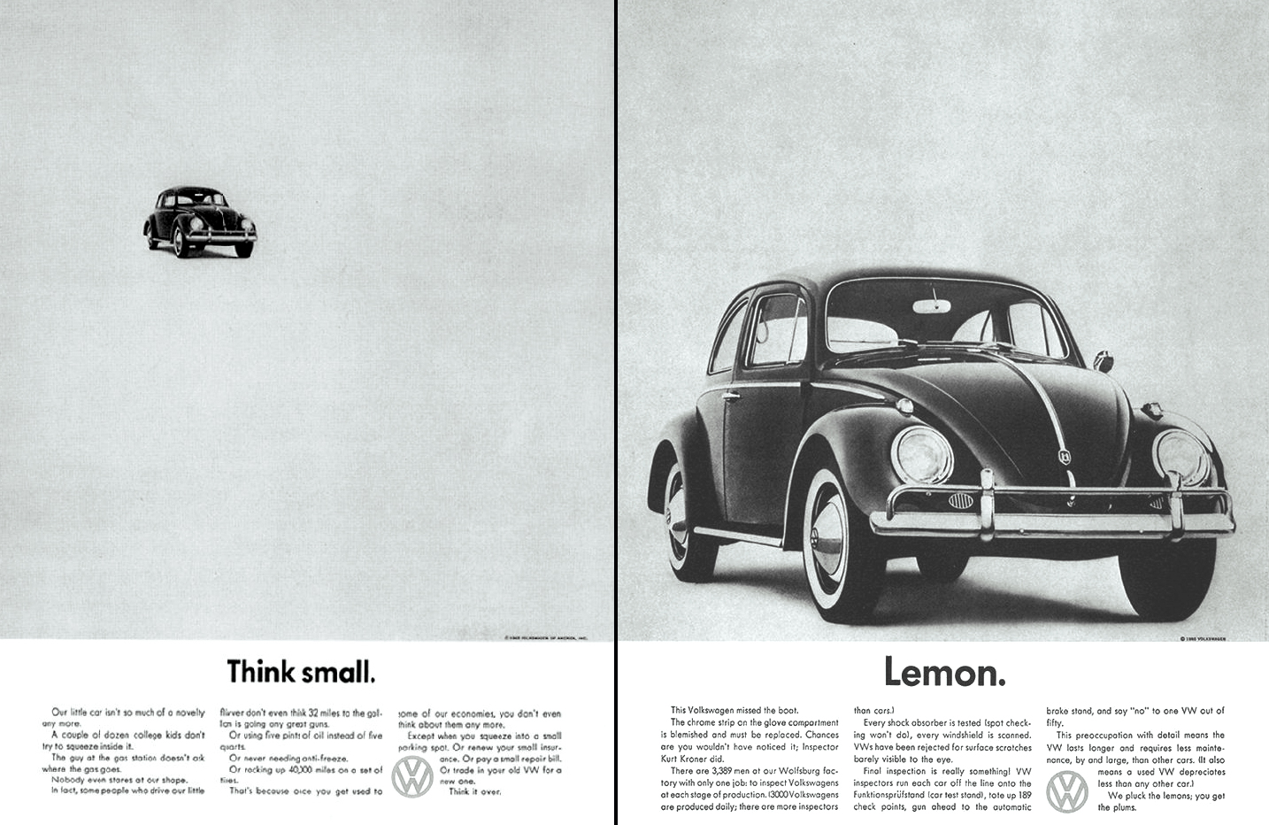
So right now I'm scrolling through my blog, and because I inserted a lot of photos with each blog, it's like I'm visually watching a slideshow of the evolution of graphic design history. I usually chose people to write about, since I felt like choosing an entire art movement would be too broad of a subject. For example, I chose to write about the work of Jules Cheret during the poster art movement. He is considered to be the main originator of poster artwork, and was also very influential in making posters and unconventional artwork, that wasn't necessarily fine art, become popular and respected as serious talented art within the industry. I feel like a lot of these artists that I wrote about went against the norm and protested against "standard art". Doyle's advertising agency incorporated a totally different sort of design, involving eccentric compositions and bold typography with eye-catching photos. It was definitely different, but what's not the norm is what brings change, and what has made graphic design evolve so wonderfully. I feel like because art is such a creative element, it's important to keep things fresh, experimental, and unconventional. 


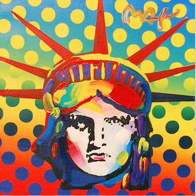
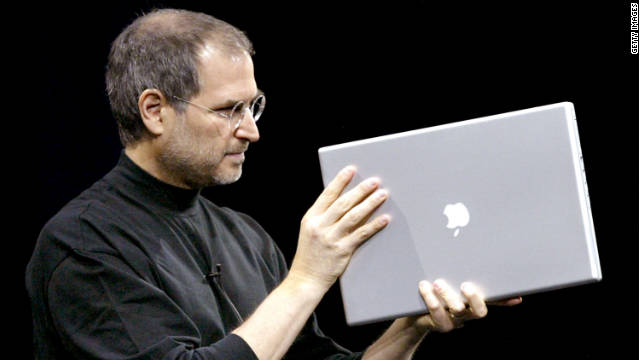
What was also unconventional was finally, the admittance and due credit to female graphic designers, such as Zuzana and Paula Scher. It was great to sort of correlate women's rights with the timeline of the amendment that gave more equality for women's rights. I thought the female graphic designers were very influential in fighting against the norm, especially those who gave a chance for digital use of graphic design, although it wasn't welcomed or respected when it was first introduced. Right now, the technology of computers has transformed our society so dramatically. Software has become such an essential tool for graphic designers who want to compete in the industry. I do admit that I feel lucky to have been born in this generation and given the opportunity to work with these digital tools, which have been boiling and preparing for many centuries beforehand. After reading about all the labor put into graphic design during the Ancient era, for instance....well, yes. Once again I'm so grateful to be born when there is so much advanced technology around us, and if I make a mistake I can easily change with a few clicks of the mouse or a touch of the keyboard. I'm sure though that in the future, the technology and potential of graphic design will be SO advanced that they'll think that our techniques are extremely trivial and painstaking, similar to what we think when we look back in history.

Wednesday, December 5, 2012

#10 - Modern Chinese Man, Min Wang

China has history. How long? Thousands of years. A lot of time to accumulate a long history of what is considered to be traditional Chinese art. You know, the beautiful calligraphy and paintings that we're all familiar of seeing in our history books...or when we think of Ancient China or stereotypical Asian art in general.


What has happened within the recent years, however, is the modernization of China. Socially, economically, and culturally, China has evolved from being a sort of third world country to a booming industrial center that now is heavily involved in the global economy. Perhaps it's even the core of the global economy, since almost everything is "Made in China" it seems. Either way, it seems almost inevitable that Western influences would someone infiltrate the 5,000-year old world of Chinese Art and mix up the style here and there. Since 1980, China has accepted international commerce along with the cross-cultural affect that sort of global exchange results in. There are many notable pioneers of modern Chinese graphic design, but the one that I feel best demonstrates the collaboration between the West and the East is graphic designer and dean of CAFA: Min Wang.

(MIN WANG!)

Min's academic background is obviously one that was strict. Although he is an artist, Min went through all the educational training, studying in America at Yale's School of Art and later working with Adobe Systems' Creative Services Department. Since he lived in America and went to school here, Min was largely exposed to American culture and the artistic style that his American peers portrayed. Then he went back to China; the result was hybridization of western and eastern design. Wang is known for his "strong cross-cultural perspective" and his ability to fuse works of more Western styles with traditional Eastern pieces. Thus, he was chosen as the perfect candidate for creating the graphics and icongraphy of the famous Beijing Olympics in 2008. 

(postage stamps of Olympics)

(design of outfits for the runners)


(the medals!)

The Olympics represent a time of global interaction. Thus, it's vital that the graphic design of the logos, clothes, medals, etc. are seen by the world as visually attractive and welcoming. Wang is able to do the job effectively by creating a plethora of items for the Olympics that are sophisticated and contain a "global aura", but also have that touch of whimsical Chinese essence. Luckily, Wang was born during a time where acceptance of Western influences with Chinese art was much more accepted. If he was born a century earlier, perhaps he wouldn't have been blessed with such a lenient opportunity, since the thousands year-long industry of Chinese art wasn't as welcoming as it was then. This reminds me of how digital graphic design or retro design wasn't widely accepted, but the graphic designers who pioneered the movements remained determined of their craft and eventually it pushed through and became widespread phenomenas. 


Wednesday, November 28, 2012

#10: Legend of Pop - Peter Max

Peter Max is a longstanding household name in the pop art scene that is akin to Andy Warhol. Since the 1960s, he has been acknowledged and risen to fame for his eclectic and vibrant style and contribution to the history of psychedelic posters during a time of great social movement, protest, and experimentation amongst the youth culture. He is considered to have revolutionized art the same way that the Beatles made such a huge impact on the music industry. Today, at 74-years old, he continues to commission legendary pieces of artwork with such prestigious patrons as the Grammys, Olympics, six presidents, United Nations, and current, popular celebrities such as Taylor Swift and Shaq.

(A younger Max in the past, doing what he loves)

(A more recent photo of Max, featuring his piece on a grand piano for Ringo Star) 


As a child, Max moved around periodically across the world, having lived in China, Tibet, Israel, France, Germany, and America. Having explored and immersed in such a diverse set of cultures and societies, Max was greatly influenced by his various surroundings and quite open-minded and enlightened by the wonders of the infinite beauty that was abundant in each different country. His insight provided a rich background and fuel for his immense artistic creativity. What really ignited his artistic endeavors, however, was his thirst and love for astronomy. He was enthralled by the grandness of outer space and celestial elements, which, combined with his love for art, created his famous, trademark technique known as the "The Cosmic '60s". This style involved a bold, linear type of painting that was art-nouveau inspired, and which utilized Fauvist color choices, and chill, transcendental themes and imagery. This style was revolutionary amongst psychedelic posters and made a dramatic impact on art during the 60s. His expressionistic, sensuous style, lavished with vibrant pigmentation and symbolism has gained him numerous followers throughout the young generations of America.


(above are prime examples of his "Cosmic 60s" style) 

Similar to other psychedelic poster designers of his time, Max did art not for commercial intentions but for establishing strong, influential social viewpoints. An environmentalist and embracer of democracy and justified freedom, Max often included his personal opinions about society in his work. He encouraged environmentalism and a healthier Earth through art. His famous works that depict The Statue of Liberty and great Presidents were dedicated to his passion for justice and a liberated American society. 

(Max's piece done to promote Earth Day)

(Max's piece done in 2000 of the Statue of Liberty. Considered to be one of his most monumental masterpieces) 

To this day Max has contributed much famous artwork to America and the world. Although many artists of olden day have disappeared or unable to compete with the more modern generation of artists, Max continues to establish and reinvent himself strongly within the industry. His styles has influenced numerous followers who implement his vibrant and distinct style in their own creations. Max has remained relevant with his work and current exhibitions of famous celebrities, from Taylor Swift and Steven Tyler to Obama! His work and style has evolved from the psychedelic days of the past to a more modern era of pop art. The man remains an influential and extremely innovative legend that continues to awe the current youth generation similarly to how he did the same during the 60s.


<"http://www.naplesnews.com/news/2009/feb/18/peter-maxs-obama-44-visits-naples/">
<"http://gregcookland.com/journal/2010/08/24/peter-max-speaks/">
<"http://www.ctpost.com/music/article/Pop-artist-Peter-Max-returns-to-Geary-Gallery-3828147.php#photo-3375018">
<"http://www.examiner.com/article/renowned-modern-artist-peter-max-gallery-exhibition-and-special-appearance-cherry-creek">
<"http://www.petermax.com/bio.html">
<"http://gregcookland.com/journal/2010/08/24/peter-max-speaks/">

Wednesday, November 21, 2012

Doyle Dane Bernbach Advertising Agency

Doyle Dane Bernbach is acknowledged for revitalizing the advertising field during what was considered to be a lackluster drought of creativity during the 1940s. The industry was strife with "hyperbolic slogans, movie-star testimonials, and exaggerated claims" (Meggs 403). Everything was being thrown and stuffed down the throats of consumers; there was an overwhelming plethora of ads screamed out  exclamation points!!! and ~~~images~~~, but it was all presented sloppily and there was too much of it! It sort of reminds me of the current advertisements that surround us, such as billboards on every highway or advertisements on every multimedia channel, such as the radio, television, Internet, etc. True, there are some advertisements that of course took the intelligent approach of Doyle Dane Bernbach and are wittily executed and done with finnese (there are even some commercials that I ENJOY watching, like the ones especially saved for the golden time of the Olympics), but for the majority there are rather crude ones that just flash at us, such as the multitude of pop-up spam ads that slimily attack us every chance they get while we're browsing the net.
(...looks all too painfully familiar? Yup...)


Well, let's return back to the foundation of what made the masterminds behind Doyle Dane Bernbach so innovative and revolutionary regarding the "Creative Revolution" of advertisement. Unlike their big-named competitors, the firm started out with only about 13 employees and half a million bucks to start-off their risky endeavor. Three main contributors were copywriter Bill Bernach, Phyllis Robinson, and art director Bob Gage. This team worked to make imagery fuse seamlessly well with a conceptual expression of an idea. They had writers work accordingly with the art directors, in what were called the ultimate "creative teams". This was actually a revolutionary (though it seems only logical) approach to advertising tactics during the time.

These teams worked together to extract out the best qualities of a product and advertise them well. They didn't infuse their ads with clutter, but rather, made sure to apply enough white, negative space in order to emphasize the object that was more important. There would be an eye-catching visual, a headline that was bold, and typographic descriptions that were factual and witty rather than rubbish. Most imagery was metaphorical or interesting enough to tickle the audience's brains and give them a rush out of seeing the picture. The Doyle approach was to treat the audience intelligently (or have them think they were being treated intelligently), making the advertisement have a more lasting impression.

Doyle Dane Bernbach certainly prospered and expanded greatly from its tiny team in New York to a huge corporation that modernly exists as "DDB Worldwide". It paved the path for many advertising firms and changed the way that people did advertisements. It was more artistic and worthwhile to create advertisements that were full of substance compared to garbage that would catch peoples' eyes because they were flashy but rather than a "good flashy", it was a disturbance in their eyes, like sunlight blinding one's eyes while driving. 

Examples of wit in my opinion include the Vitamin Water passages, that, unlike most boring water bottles, include a quip or witty passage about the product. The Apple ads also are simplistic, yet have a bold, impactful headline that have made the products so admired and the advertisements so attractive. I feel like the Apple advertisers are the spiritual lineage of Doyle Dane Bernbach in a way, since they are so innovative in their advertising strategies and everyone's copying them because they're so successful. 

Works Cited:
Meggs, Phillip B. Meggs History of Graphic Design. 5th. New jersey: John Wiley, 2012. 360. ebook.
<http://www.transatlanticperspectives.org/entry.php?rec=35>
<http://us.ddb.com/who-we-are/roots.html>
<http://www.historyofads.the-voice.com/the-creative-revolution>

Wednesday, November 14, 2012

#7: Ben Shahn

Immediately when I saw this poster that Ben had done (in the textbook), I knew I had to know more about this amazing graphic designer.
The anti-Nazi propaganda poster that Ben commissioned for the United States Office of War Information is nothing short of eye-catching, but in a shocking and mortifying kind of way. Most of his works is notable for being realistic, but in a grim manner that concentrates on matters that most people would rather remain ignorant or blind to. He forces us to recognize forces such as malnutrition, war, genocide, and corruption through his vibrant pieces. There aren't as many strong pieces that are shown publicly by the government in this modern era, apparently to shield us of the "horrors of wartime" etc. Like how the beheading of Pearl in the Middle East was censored and the killings of those in Afghanistan aren't blatantly shown. The government doesn't want to create a riot or protests/any sort of chaotic commotion out of the people, so this sort of poster that Ben did was actually revolutionary for his time and of course, rare in that the U.S. Office of War only allowed 2 of his posters to be published out of the many more critical ones that he finished. (Much to his admitted disappointment)

Ben's social-activist artistic style can be traced through his childhood and the environment of his upbringing. Born in Kaunas, Lithuania in 1898, a young Ben immediately faced the desperation of hardship when his revolutionist of a father was exiled to Siberia, leaving him, his mother, and siblings surrounded in a state of hostility. They were able to escape to the shores of America and reunite with their father in New York, which during that time, was also experiencing poverty and a state of turmoil due to the effects of the Great Depression. Ben's experiences from his father's revolutionary influences and the social problems that he personally viewed in front of him shaped his decision to embark on a (starving artist) career of creating works that sent out a message; graphic design that was meant for activism and to rile up viewers to do something about these dire issues. He ditched his path of going to medical school and went through a trek of artistic pursuit. Interestingly enough, Ben wasn't too keen about traditional European art and instead focused more on modernism. 


His creative style was a mixture of expressive and visual languages, lithography, character portrayals and urban art. Ben often paired together contrasting values or scenes in order to create a surprise element to his pieces, or to emit an aura of tension in order to seed out a reaction from the audience. He included aspects such as starving children, farmers toiling in the field, blood, sweat, death, the corruption of society and humans that we don't usually see in art. The stereotype is that art is supposed to be something aesthetically pleasing, but these graphic designers of the modern age threw away that assumption and used art as a communicative tool to send out a strong, dramatic message against social problems. Ben was especially one of the most monumental of these artists and his works are often attributed to having encouraged some of the points of Roosevelt's New Deal. His invested work in photography and design that showed the devastation of people during times of hardship made people realize the troubles that were going on, which poked at the government to do something about it. Ben to this day is, of course, long dead, but remains a fascinating figure that can definitely inspire all of us to think outside of the box of the potential of what graphic design is capable of. 

(This is a in-depth montage about Ben's life and achievements) 

Sources:
Meggs, Phillip B., and Alsto W. Purvis. Meggs History of Graphic Design. 5th. new jersey: John Wiley, 2012. 360. ebook. 
<http://xroads.virginia.edu/~am482_04/am_scene/bioshahn.html>
<http://www.archives.gov/exhibits/powers_of_persuasion/this_is_nazi_brutality/images_html/this_is_nazi_brutality.html>
<http://www.spartacus.schoolnet.co.uk/ARTshahn.htm>
<http://www.georgekrevskygallery.com/artists/shahn/index.html.>

Wednesday, November 7, 2012

#6: Heroic Realism

In Chapter 14 the material begins to delve more into the aspects of pictorial modernism. The event of the World War II greatly affected the usage of posters as vital tools of graphic communication. Using simplified visual language that could send out a clear, convincing message to a largely unintelligent, fickle public was key. There are many forms of poster designs, but the one that caught my attention was the usage of "Heroic Realism". The style wasn't really expanded in the text (compared to stuff like the Plakatsil) so I thought it'd be a relatively interesting topic to research outside of the reading material.

"Heroic Realism" is an art motif that is generally used as a propaganda strategy. It is popularly and efficiently used by communist/socialist governments in order to control and sway the mentality of their people through emotional visual cues. During the Nazi regimen, Hitler delved away from the abstract poster work of the war and decided to imitate the more literal design style of The Allies' poster work. Hitler strived to appeal to a unintelligent mass of people, and succeeded in controlling their beliefs and mindsets largely through his speeches and manifestos, but also equally as important as through his commissioning of posters that contained elements of "heroic realism". He often portrayed the glorious, Aryan figure as an idol for all the German people to admire and remind them about the goal of the Nazi ideology. Heroic figures, such as celebrities or war heroes, are often idolized and can easily control people's actions. The Nazis purposely created posters that demonstrated strength and honor in a perfect "hero" who's bravery could be best acknowledged through service for his government and self-sacrifice. "Classic" figures that promoted strength and honor united a nationalistic morale amongst the German people.


Similarly to the Nazis, the Americans, British, and other Ally members also used heroic realism to inspire people to join the war. The most popular historical piece could be considered to be the Uncle Sam poster that points at the viewer and convinces them that joining the army is the dignified and right choice to take.
The poster is bursting with nationalistic pride and was extremely successful in convincing many young American men into being recruited into the U.S. Army. It boosted the national morale of the people and inspired them to be more involved in the war. This poster especially reminds me of the Captain America Movie, where Captain America as a young lad sees this exact poster and is immediately motivated to join the army even though he is weak and frail. His desire to be "heroic" is the poster's successful goal for its viewer. Heroic realism tricks people into feeling that glamorous sense of heroism and adrenaline to do something awe-inspiring for the country.

Heroic Realism is timeless; in this present age, aspects of it are still heavily used. For example, U.S. army commercials that showcase the galvanizing and benevolent acts of those in the army as "cool, proud, and adventurous" inspire many young people to join because they want to be respected, admired, and be apart of protecting the country as a "hero". It makes me wonder how easily we can be continued to be swayed by propaganda, and if it's morally ethical to use heroic realism to manipulate our minds, especially since in this era we are less ignorant and more educated about matters.


(Attached is an advertisement to join the Navy. It's really cool)

<http://webartacademy.com/fine-art-heroic-realism>
<http://www.eyemagazine.com/feature/article/designing-heroes>
<http://www.howarddavidjohnson.com/visionary/mystic.htm>
<http://www.nytimes.com/2008/11/11/business/media/11adco.html>
<http://www.loc.gov/exhibits/treasures/trm015.html>


Tuesday, October 30, 2012

Blog #5 - Jules Chéret

For the reading of these two chapters, there were a plethora of amazing artists describe. Somehow though, Jules Cheret was the one that caught my attention.

Jules Chéret was perhaps one of the most prominent forerunners of bringing and expanding the philosophy of Art Nouveau within French society. Born in May 1836, Chéret was often famed as the first official poster work designer, in a time where advertisements were mostly adorned with mainly just typography. His modern, lithographic posters were eye-catching and a visual breakthough, which proved popular amidst the public and potent advertisers. At first his revolutionary poster designs were not welcomed by a stringent cliche of artists who considered that only fine art, such as painting and sculptures, were what consisted of "fine art" while anything else, like cartoons or graphic poster works, were nothing more than amateur doodles. Nevertheless, many people also supported Jules and his work and paved the way for his success and legacy, along with the result of an inspired league of his followers of creating modern poster designs.


 Jules Chéret was born in Paris, France, to a moderate family, that wasn't wealthy enough though to send him to the most lavish of schools. Chéret actually ended up leaving Paris (but later returned) because he couldn't find enough opportunities for a career for his type of art style. Instead, he moved to London with expectations that the scene there was more liberal, experimental, and accepting. Cheret endured numerous hardships and not enough income, but was determined to succeed. He started off with small jobs, such as creating bookcovers for publishing firms, along with creating advertisement posters for entertainment industries such as the theater, circus, cabarets, music halls, singers, celebrities, etc. Eventually his work was more recognized as it colorfully lit the walls of buildings and bulletin boards. His style was applauded for revolutionalizing the use of color, along with his jubilant imagery that stirred people's senses. His designs were often eye-popping, and colored in a sort of color-book style, with soft pastel colors matched with vibrant positioning of text for the headlines.
 His most notable features in his posters may very well be the beautiful, joyful "Cherettes" (as they were popular called), women who seemed alive as they twisted, danced, and skipped on paper. They almost look alive and touchable, like they'll pop out at any moment and invite you to join them at the cinema or theater or whatever arena or event that they were advertising. His poster works and the women that he illustrated emulated an aura of happiness and joy which attracted the public. The women especially became a symbol for feminism, since the women seemed so liberated and freed from their social, gender restrictions as the typical calm and reserved woman.

 Below is a video clip showcasing a montage of his greatest works:
 
Besides creating a revolution of the Art Noveau movement, he also revolutionized and created a strong following for poster work, along with other types of art styles that was considered unconventional or not apart of the standard that is "fine art". Many art critics actually celebrated Cheret's posters, claiming that the posters littered outside the streets was far superior compared to the fine art "stuff" that was being hung in the museums. I believe that Cheret also (perhaps indirectly or unintentionally) fueled the revolution for feminism through his depiction of lavish, merry, gleeful women. 


Nowadays, in this modern time, the movie posters that we have don't have that certain "charm" that Cheret's posters displayed. Instead of having hand-drawn illustrations, most posters feature a photograph done in photoshop. I understand that times and technology have evolved, but I wish that the movie posters that we had today could still capture that certain aura. 

 
I feel like Cheret is a timeless inspiration to all graphic designers and aspiring ones (like myself). His invention of the modern poster has ignited a passion for making advertisements that are true pieces of artwork.
Works Cited:
http://www.cheret.info/index.html
http://www.jules-cheret.org/
 

Wednesday, October 24, 2012

Module 4: The Great Exhibition of 1851

This week's readings of Chapter 9 and Chapter 10 continued to pave the way forward towards graphic design history. Suddenly we are cast in the bustling era of the 19th century, a time of massive growth and technology advancement due to the historical Industrial Revolution. Civilians are no longer focusing on agricultural labor work, but rather, building innovations and mass-producing material objects in factories. This revolution brought a great leap of inventions and a dramatic transformation to peoples' former lifestyles. This revolution especially benefited the Victorian reign in England.

During the 1850s, there was a rise of innovation and high morale that could be represented by the term, "Victorian". This was the pride of the industrial era's spirit and cultural revival. Prince Albert, Queen Victoria's husband, proposed that there be a huge exhibition and collaborative effort of all the industrial inventions and aesthetic creations that had been put together during that time lapse. He quoted it as the "Great Exhibition of 1851", which worked as a summation of the Industrial Revolution's progress, and can be considered a point in time for future innovation.


This exhibition is often coined as the "Crystal Palace Exhibition", namely because of the impressive cast steel and glass architectural design that housed the event. The exhibition was a grandiose party of sorts, inviting the most celebrated of noteworthy figures, ranging from literary geniuses such as Lewis Carroll, to scientists such as Charles Darwin. This dream exhibition, considered by many as the first world fair, was an international meeting. England was economically booming during the Industrial Revolution, and during a time of peace, wanted to show off and display their success. People all over the world traveled to Britain for the event, with an estimated six million guests attending to get a glimpse of what was glamorously being exhibited.

The intention of the exhibition was to heighten the bar of industrial design. It was an opportune chance for other nations to share what they had created, and receive feedback and inspiration from the other nations. Also, it was to advertise products and create larger, more international, markets. Of course, there was always a leading nation (in this case, Britain, with their typographic printing presses), similarly to how Apple is a leader for technological gadgets, but every other company is watching and following up with products that are close to Apples' inventions.
Besides industrial inventions, there was a plethora of designs, ranging from illustration to mosaic, that were on display. There was an abundance of Victorian graphic design, which displayed and captured the morals and cultural values of that era. A noteworthy observation was that the majority of the mediums used for the graphic design works were through lithography.

Wednesday, October 17, 2012

Module 3: the life of Gutenberg


Johann Gesnfleich Zum Gutenberg is widely regarded as the "creator" of moveable-type printing press amongst Europe (although there is recent evidence that moveable-type originated centuries further in Asia). His legacy is still prominent to this day, with his famous 42-lined Bible probably able to fetch a staggering $100 million, and a mere leaf page at the value of $100,000. I thought that was insane, and really made me realize how rare and revered this man's work was and how his historical invention and passion for print really impacted all of us.


He was raised from a relatively wealthy background, but near the end of his life he was poor, having had dedicated his life to his work. As I was reading about his experiences and hard work in the textbook, I was suddenly shocked when I realized he was stripped away of his laborous efforts by his loaner/benefactor, Johann Fust. (Is it weird that their names are the same? I think so) Luckily, history has been able to credit Gutenberg as the original creator of the first book, but Fust, along with his accomplice, were the ones who happened to profit from the production of Gutenberg's work, while Gutenberg himself drifted off into poverty for a long time before given his rightful title/credit.


Perhaps it's just my opinion, but I really felt like Fust was the epitome of a loan shark. Unfortunately, sources mention that his family was able to thrive for many generations, so I'm not sure if karma was ever handed to this man. Nevertheless, I felt that Fust lended money to Gutenberg and sued him TOO coincidentally, right at the eve of Gutenberg's completion of the Bible. He probably had an ulterior motive, then, when he agreed to allowing Gutenberg to borrow money.


At a young age Gutenberg was able to have access to the latest manuscripts that were done with block-printing. Mesmerized by this style, Gutenberg set out to create and improve the style, along with a way to spread it to the masses. He worked diligently and created printing presses, improving the wood-block to a more metal-type substance and designing methods in typography and how the structure of each page would be perceived. Gutenberg was a very hard-working man, and his foundation and creation of the first book was a cultivation of work throughout many years, along with the investment of a lot of money and the sacrifice of his wealthy lifestyle.

Unfortunately, he was taken advantage of by Fust, who ended up finishing up what was left of his work and using it to propel mass profit. Optimistically-speaking, his work WAS able to get out, and became a monumental invention, and Gutenberg was eventually credited for his work by society. Today his legacy is still prominent in his city of Mainz. Museums have even been created in his honor. I suppose, similar to how great artists are only celebrated after their death, Gutenberg was a tragic artist of printing.


Sources:
Meggs, Phillip B., and Alsto W. Purvis. Meggs History of Graphic Design. 5th. New Jersy: John Wiley, 2012. 72-80. eBook.
http://www.greatsite.com/timeline-english-bible-history/gutenberg.html
http://www.gutenberg-museum.de/index.php?id=29&L=1
http://www.mrdowling.com/704-gutenberg.html
http://www.bl.uk/onlinegallery/onlineex/landprint/gutenberg/index.html

Tuesday, October 9, 2012

Module 2: Hieroglyphics

After being spoiled by only looking at pictures for the first field journal, this second assignment felt really overwhelming reading-wise, but I guess it catches us off guard and now we can anticipate how the workload will be for this class. Thank goodness, though, that the material isn't boring, and it's actually historical events and origins that are interesting to read up about.


The section that I was most keen about was the first chapter, (I feel like I'm a sucker for the Paleolithic age and early Egyptian civilization stories) especially the parts describing the Ancient Egyptians and their use of hieroglyphics as their form of formatted communication. It's interesting to compare our modern alphabet and writing system with the Egyptian's. We have 26 letters in our alphabet; the Egyptians had 2,000+ symbolic characters to express themselves with. In comparison, I guess it's easier to live in this modern world of not having to memorize so many characters, but I must admire in awe at how complicated their system was back then. Hieroglyphics translates to "sacred writings" which was exactly how the people perceived it as. The writings were reserved mainly for the elite, such as pharoahs and the higher class, to understand and utilize. I believe that hieroglyphics hold much more reverence and importance when used compared to how we write today. We simply use writing as a tool for communication, while hieroglyphics were respectfully used for glorifying.

Often times, most hieroglyphics were found inscripted on the walls of pyramids or covered on tombs. Using hieroglyphics was popular for "books of the dead", which were basically written to help aid the deceased please the realm of the gods and avoid damnation. Pharoahs often were regarded with expensive hieroglyphics that avidly illustrated their majestic life. Pictographs and phonographs were used to symbolize events that happened during an important person's lifetime. Most of the drawings were 2-dimensional and involved drawings of the revered gods, humans, and often animals were correlated into the picture, such as cats or owls. Anubis, the god of death, was included respectfully on hieroglyphic murals in order to appease to his bidding and help the deceased hopefully pass his test of virtue. 


For many centuries historians were unable to understand how hieroglyphics were used as a visual language, and it was for a long time a hidden, secret sort of use of communication. However, recently researchers have been able to decode the characters used, especially with the recent discovery of the Rosetta Stone, which also was translated in several other languages. 

Sources: 
Meggs History of Graphic Design, 5th edition